Posts tonen met het label charts. Alle posts tonen

04 oktober 2020

Tips for bar charts - PPT 2019

Some time ago I wrote an article with a few tips on the use of line charts.
Please feel free to have another look here: Tips for line graphs

I am using the same data as in my article on line charts, sales results from 10 European countries over a period of 4 years. As you can see the items in the 2020 column have been sorted from top to bottom in the datasheet.


A bar chart is ideally suited to compare values, for clarity I have hidden the previous years in the datasheet so that only the current year is shown. I have chosen a horizontal bar chart so you can compare the data more easily and there is more space for text.

The chart has been enlarged after placement to cover just about the entire slide. As there are 4 data columns the color of the bars is Gold accent 4 from the default PPT theme. The chart looks like this after inserting it:

1. Adjust the gap width between bars, apply if necessary another fill color and add a border

The default gap between the bars is 182% of the height of the bar. That is simply too much.
Double click a bar, in the Format data series task pane adjust the Gap Width. In the example I lowered it to 80 %.


Click any bar, all the bars will be selected then under Chart tools go to the Format tab, click the Shape fill button and choose a suitable color, in the example I chose the blue accent 1 swatch.
Then click the Shape outline button an apply the color black and change the thickness to 1 1/2 points.

2. Change the order of the bars, from top to bottom The default order of bars is in reverse rank order.


The bars are ordered with the first (highest) data point at the bottom. If you want to rank the bars with the longest bar at the top you have to reverse the order. Double click the Y-axis, in the Format axis pane under Axis position check the Categories in reverse order checkbox.


3. Delete the legend, gridlines and the x-axis data if they do not contribute to the clarity of the chart


4. Add data labels to the chart

Select a bar and click on the Add chart element button, check Data labels and choose the position of the label in our case Inside end, the click More options, under Number use the currency symbol and remove the two decimal places. 


Select the labels and change the font color and size if necessary.


5. Change the font and font size of the text on the axis and title

The text on the chart is too small. Select the Y-axis and choose another font and font size. Do the same with your title.
       

6. Finally emphasize the most important items in the chart

In my example I changed the bar with the highest sales and the bar of my country. To do that click on a bar (all the bars are selected) and click again to select only one. Change the color with the shape fill button.


08 oktober 2018

Tips for line graphs in PPT 2013

1. Do not use too many series.

Below an example of sales results in 10 European countries over a period of 4 years. The default settings have been used. As you can see it is a bit of a mess, lines crossing each other make it virtually unreadable. The legend does not help much.


By splitting the data into two charts, one for the best scoring countries and one for the lowest scoring countries results are usable. See the result below for the best scoring countries.


2. Don’t start the Y-axis scale at zero; break the scale if needed.

You can adapt the scale, in our example you can start the Y-axis at 300.000 €.
Double click the Y-axis, in the task pane Format axis, change the minimum value. The chart is more balanced, no more excess white space below the series.

3. Start the series on the Y-axis

For clarity let the series start at the crossing of the two axes.
Double click de X-axis, in the task pane Format Axis, under Axis position, choose On tick marks. Now the starting value can be read easier, the series line continues to the end of the chart.


4. Do not use gridlines when it is not necessary

The most important thing in the chart is to see the trend the results are following over a period of time. The exact values are less important. 
Select the gridlines by clicking on one and press Delete.


5. Do not use a legend instead use direct labelling of the series

Click on the series to select it. Click one intersection point so that it is the only intersection point selected. Right click it and in the quick menu choose the Add data label option and then Add data label again. The value now appears next to the intersection point.

Click the value once, then click it again, finally right click the value and choose Insert data label field.


Choose the name of the series, in our example [Series]France.


You can move the data label. When you move it a leader line may appear. You can use the leader line to your benefit to improve clarity, especially when series lines cross. In the example I formatted the line by changing the width and added an end arrow point. Just select the leader line by clicking on it, right click it and choose Format leader lines.


After some additional formatting the chart looks like this:


18 november 2015

Chart data labels with a callout in PPT 2013

Just finished a series of blogarticles on using callouts on data labels in Dutch. If you want an English version hurry to Geetesh Bajaj's site and read the following articles:

Chart Data callouts
Format data labels for charts
Change callout shape data label

This will give you a complete explanation, far better than I could ever explain in English.


13 september 2013

What's new in PowerPoint 2013-42 - Charts combo

Microsoft finally added a new chart type, combo.


Now you can easily represent different values on two Y-axis.

11 september 2013

Wat is nieuw in PowerPoint 2013-41 - Grafieken type combo

Er is een nieuw grafiektype toegevoegd, de keuzelijst. Kies op het Lint Invoegen de knop Grafiek, in de groep Illustraties, selecteer de optie Keuzelijst.

Dit type laat je toe met om gemakkelijk met twee Y-assen te werken.


Kies voor iedere reeks het gewenste type onderaan:


Kruis aan welke reeks op de secundaire as moet getoond worden.


06 september 2013

What's new in PowerPoint 2013-40 - Charts formatting

When you click on a graph in PowerPoint 2013 you will see three buttons at the side allowing you to easily change your graph.

The first button is the Chart Elements button:


The second one is the Chart Styles button:


The last one is the Chart filter button:


04 september 2013

What's new in PowerPoint 2013-38 - Charts data

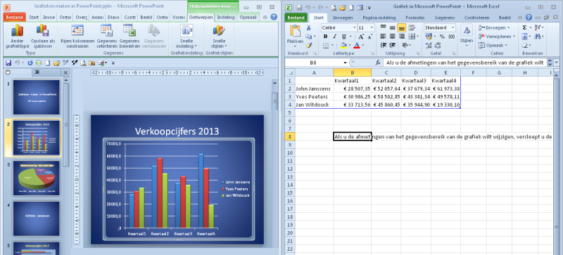
When you insert a chart in PowerPoint 2007-2010 you get the data in an Excel window. Unfortunately the Excel window takes up half of your screen.

PowerPoint 2010

In PowerPoint 2013 you get a small window containing the dummy data, Excel is still active, if you want to see the whole Excel window just click on the icon in the title bar.

PowerPoint 2013
Sort of takes us back to the days before the ribbon, when a similar data window was used in Microsoft Graph.


02 september 2013

Wat is nieuw in PowerPoint 2013-37 - Grafieken - data

In PowerPoint 2007-2010 kreeg je bij het aanmaken van een grafiek een apart venster met daarin de data in Excel. Dat was knap vervelend aangezien het venster van Excel de helft van je scherm in beslag nam.

PowerPoint 2010

In PowerPoint 2013, krijg je nu alleen nog een kleiner venster met de data te zien, de gegevens staan nog altijd in Excel. Als je het grotere Excel venster wil gebruiken klik op het pictogram van Excel in de titelbalk van je venster.

PowerPoint 2013
In feite keren we enigszins terug naar de interface van vorige versies, bv. versie 2003 en vroeger, behalve dat de gegevens in Excel staan en niet in een apart programma.


25 juni 2012

Controleren grootte grafiek bij plakken vanuit Excel

Controleren grootte grafiek bij plakken vanuit Excel

Bij het plakken van een Excel grafiek kom je nogal eens in de problemen, de grafiek is te groot of te klein. Vooral wanneer je de grafiek in Excel op een apart werkblad hebt geplaatst. Manueel aanpassen is natuurlijk een mogelijkheid.


Beter is van gebruik te maken van een tijdelijke aanduiding. De Excel grafiek past zich automatisch aan binnen de tijdelijke aanduiding.

Gebruik bv. de dia-indeling Titel en object. Selecteer en kopieer je Excel grafiek. Selecteer de tijdelijke aanduiding door op de rand te klikken.


Plak je grafiek, deze past automatisch in de tijdelijke aanduiding, niet nodig om manueel te herschikken.

23 juni 2012

Een Excel grafiek gebruiken met behoud van de opmaak

Een Excel grafiek gebruiken met behoud van de opmaak

Wanneer je een Excel grafiek kopieert en plakt in PPT 2010 dan wordt standaard de opmaak van het PPT thema toegepast. Als dat is wat je wilt, geen probleem. Wil je echter de opmaak van het Excel bestand behouden dan kan je beroep doen op de plakopties die in PPT 2010 fel zijn verbeterd.

Klik niet op de knop Plakken maar klik op het pijltje onder de knop, daarbij krijg je een aantal plakopties, kies het tweede icoontje. Dit zorgt ervoor dat de opmaak van de oorspronkelijke Excel grafiek behouden blijft.

22 juni 2012

Use Excel chart in PPT and keep its formatting

Use Excel graph in PPT and keep its formatting

When you copy paste an Excel chart, PPT adapts the chart to the theme in use in your presentation. If that is what you want, no problem. If this is not what you are after, and you want to keep the formatting of the Excel chart, you can use the paste options, which have been improved in PPT 2010.

When you paste the selected chart, do not click on the Paste button but instead click on the little arrow beneath it which gives you several Paste Options. You need the second icon.
This will keep the original formatting of the Excel chart.

30 december 2009

Omzetten PPT 2003 grafiek naar PPT 2007 grafiek

Omzetten PPT 2003 grafiek naar PPT 2007 grafiek

Laat ons van de veronderstelling uitgaan dat je een aantal grafieken uit een PPT 2003 bestand wil kopiëren naar een PPT 2007 presentatie. Maar je wilt tegelijkertijd de mogelijkheid hebben om de nieuwe gereedschappen van de versie 2007 te gebruiken.

Eigenlijk is dat niet zo moeilijk. Kopieer en plak de PPT 2003 grafiek.

Dubbelklik op de grafiek. In het daaruit volgend dialoogvenster kan je kiezen tussen Converteren - Alles converteren - Bestaande bewerken.

Maak je keuze, de grafiek wordt geconverteerd en alle contextuele tabbladen zullen beschikbaar zijn om je grafiek te bewerken.

Origineel 2003 bestand

Omgezet bestand met knop Converteren


Bewerkbaar bestand met MS Graph, met knop Bestaande bewerken


20 december 2009

Convert Office 2003 charts to Office 2007 charts

Convert Office 2003 charts to Office 2007 charts

Say you have a PPT 2003 presentation containing some charts and want to copy those charts to PPT 2007. But you want to be able to edit the chart and use all the new tools available.

Well it's not at all that difficult, copy and paste the PowerPoint 2003 chart. Double click the inserted chart and you will be presented with a dialog which allows you to convert, convert all or maintain existing format. 

Make your choice. The chart will be converted and all the contextual tabs available to edit your chart.

Original chart (image):


Converted chart


Legacy chart


31 januari 2008

Edit chart in PowerPoint 2007 - Een diagram editeren in PowerPoint 2007

Edit a chart in PowerPoint 2007

Till version PowerPoint 2003 one used the MS Graph program to make and edit charts in PowerPoint. This has ended, starting with this version charts originate from Excel.

In PowerPoint 2003 it was easy to edit a part of a chart, a mere double click on the item in question and one could start the editing process. Not so in PowerPoint 2007, in fact Microsoft totally left the double click road.

But no panic, there are different ways to edit a chart.

Click the contextual Layout tab and in the Current selection group click the Format selection button.

Or right click the item you want to edit and choose Format X in the quick menu.

Een grafiek editeren in PowerPoint 2007

Tot en met versie PowerPoint 2003 werd het programma MS Graph gebruikt om grafieken te maken of te editeren. In PowerPoint 2007 daarentegen worden grafieken aangemaakt via Excel.

In PowerPoint 2003 was het gemakkelijk om een onderdeel van een grafiek te editeren. Een eenvoudige dubbele klik op het betrokken onderdeel en je kon meteen editeren. In PowerPoint 2007 werkt de dubbelklik niet meer.

Maar geen paniek je kan nog altijd heel snel elementen editeren en wel op de volgende wijze:
Klik op het contextueel tabblad Indeling onder Hulpmiddelen voor grafieken, in de groep Huidige selectie klik je op de knop Selectie opmaken:


Of rechtsklik op het betrokken onderdeel en vervolgens kiezen voor As opmaken in het snelmenu.